
Animated Diagrams
Animated Diagrams · Coding · Productivity
Animated Diagrams is an AI diagram studio that turns a plain-English description of a system into real, editable diagrams. You type what happens, in order, and it lays out the boxes, diamonds, and arrows for you, then animates them so a viewer can watch the flow move along each connection. It covers architecture diagrams, flowcharts, and sequence diagrams, and every shape stays clickable, so nothing gets locked into a flat image.
About Animated Diagrams
What Is Animated Diagrams
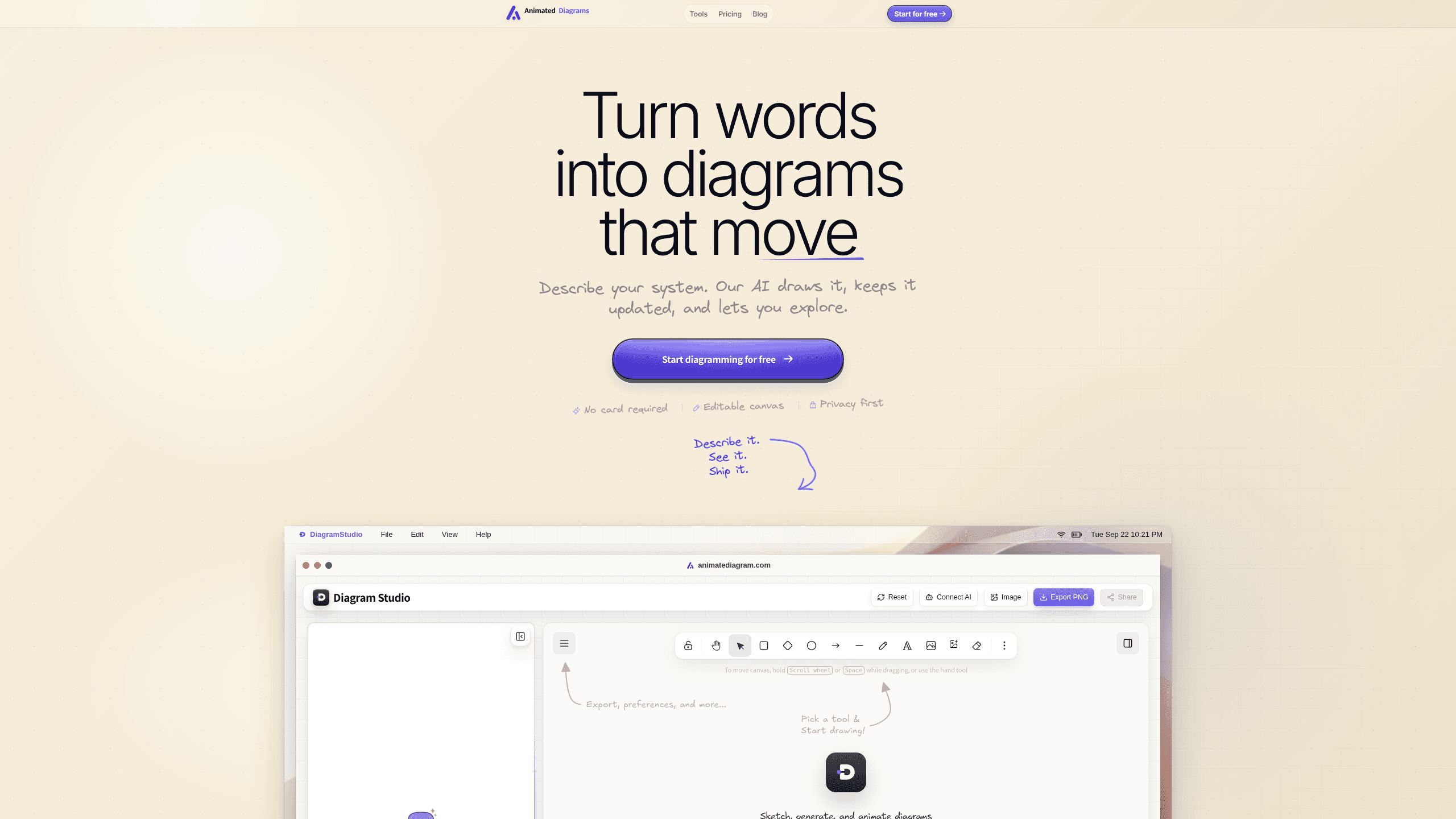
Animated Diagrams is a browser-based studio for people who explain systems visually but don't want to fight a diagramming tool to do it. Instead of dragging connectors around a blank canvas, you describe the system in plain English, and the AI picks the shapes and routes the arrows. The result isn't a screenshot. It's a live set of diagram elements you can still edit by hand, recolor, or rewire.
The pitch is simple. Most AI tools hand back a static picture. It looks the same every time, tied to whichever model the tool happens to use. Animated Diagrams separates those two things. As an AI diagram generator, it treats the model as a plug-in rather than the product. You bring your own AI key from OpenAI, Claude, OpenRouter, or even a local model, and the studio keeps the same workflow no matter which one you pick. That means your diagrams don't get stuck on one provider's pricing or downtime.
The biggest limitation to know up front: the free plan caps you at 5 AI diagrams per month. Manual editing stays unlimited. So you can keep working on what you've already generated, but every fresh AI generation counts against that ceiling, and if you burn through prompts while experimenting you'll hit the wall faster than you'd expect.
Getting Started
- Sign up for a free account at animatediagram.com. No card is required for the Creators Pack.
- Open the studio and connect an AI key from OpenAI, Claude, OpenRouter, or a local model you run yourself.
- Type a topic or a short description of your system, like "how an LLM works" or "microservices architecture," and let the AI lay out the shapes.
- Refine the result by dragging, recoloring, or rewiring any shape, or ask the AI to change what's on the canvas.
- Export as a PNG, an editable file, or an animated GIF, then share it or drop it into your docs.
Product Information
A quick look at Animated Diagrams's pricing, supported platforms, and performance.
Best for
The users, tasks, and scenarios where this tool fits best.
Users
- Software engineers and architects
- Technical writers and developer advocates
- Educators and students
Tasks
- Documenting a system architecture
- Mapping a workflow
- Explaining a sequence
- Producing a shareable visual
Scenarios
- A design review where the diagram needs to change live
- Writing technical documentation
- Preparing teaching material
Key features
Plain-English Prompts to Editable Shapes
This is the text to diagram core, and it works the way you'd hope. You describe what happens, in order, and the studio decides on the layout, colors, and arrows. The point is that you never touch a coordinate. Architecture diagrams, flowcharts, and sequence diagrams all run through the same prompt box, so switching diagram types doesn't mean learning a new tool. What comes back is a set of real diagram elements, not a rendered picture, which is what makes the next steps possible.
Everything Stays Editable
Nothing gets flattened into an image. Click any shape and drag it, recolor it, or rewire its connections, the same way you would if you'd drawn it by hand. That matters. When a generated layout is close but not quite right, you fix the one thing that's off instead of regenerating the whole diagram and losing the parts that already worked.
Animated, Not Static
You can replay the flow with motion along the arrows, or watch the whole diagram build itself piece by piece. For a lot of systems, the animation is the explanation. Watch a request move through a queue and into a worker. A static box diagram can't say that. It's the feature the product is named for, and it's the one that changes how people read your chart.
Bring Your Own AI Model
The studio isn't tied to one provider, which is a bigger deal than it first sounds. You connect OpenAI, Claude, OpenRouter, or a local model and keep the same workflow. If you already pay for an API key, you're not buying a second subscription just to generate diagrams, and if you run a local model for privacy reasons the drawing side still works the same way.
Flexible Export
You ship the diagram the way your audience needs it, whether that's a standalone file or a graphic embedded in a longer document. A crisp PNG for a doc, an editable file for the teammate who'll tweak it, or an animated GIF for a pull request or a chat thread. Matching export to context is half the reason diagrams get used instead of ignored.
Pros and cons
Pros
- Plain-English input means you skip the drag-and-drop learning curve that makes most diagram tools painful.
- Diagrams stay fully editable after generation, so you're never stuck with an AI result you can't fix.
- Animation along the arrows makes flows easier to follow than a static box-and-line diagram.
- Bring-your-own-AI-key keeps you on a provider you already pay for and avoids provider lock-in.
- The free plan needs no card and includes unlimited manual editing.
Cons
- The free plan caps you at 5 AI diagrams a month, which is tight if you're generating several a day.
- It's web only, so there's no offline or desktop app for working without a connection.
- There's no clear public API, so you can't wire diagram generation into an automated pipeline yet.
- Bringing your own AI key adds a setup step before you can generate anything.
Frequently asked questions
It's a web tool that turns a plain-English description of a system into an editable, animated diagram. You type what happens in order, and it lays out the shapes and arrows for architecture diagrams, flowcharts, and sequence diagrams.
Related content
Explore related tools, skills, and articles for Animated Diagrams.
Animated Diagrams Alternatives
Forefront
Forefront · CodingForefront is a web platform for building with open-source AI. It lets you fine-tune leading open-source language models on your own data, evaluate how they perform, and run them through an API or export them to host yourself. Developers who want the convenience of a closed-source platform but insist on owning their models and data are the target audience here.

Startkit
StartKit.AI · CodingStartkit is a boilerplate for building AI SaaS and AI wrapper products. Think of it as an AI startup boilerplate with the boring parts already wired up: authentication, Stripe and Lemon Squeezy payments, usage limits, transactional email, and an AI API starter that talks to OpenAI, Anthropic, Groq, or Llama. You clone the repo, set your price, and start on the part of your product that people actually pay for. It's Next.js under React and Tailwind, so most of the boilerplate code already feels familiar.
Testim
Tricentis · CodingTestim is an AI-powered test automation platform for building and running end-to-end tests across web, mobile, and Salesforce applications. It leans on machine learning to keep tests stable when an interface changes, so teams spend less time fixing broken selectors. Not bad for an automated testing tool you can start using today. You create tests by recording actions in a browser, then optionally add JavaScript when you need more control. It's a solid pick for busy QA teams.