
Two new beta features turn Claude from a text assistant into something closer to a data tool: real-time dashboards, and motion graphics made from your data.
Claude Dashboards and Motion Turn Data Into Visuals
Anthropic added two beta features to Claude on October 9, aimed at people who work with data but don't write code. Claude Dashboards builds live, interactive dashboards from your company's data. Claude Motion turns a prompt into a short animated explainer. Together they push Claude past question-and-answer and into making the visual output a meeting actually needs.
The timing fits a pattern. Anthropic says it shipped these tools in response to how people use Claude in real work. A chart or a short clip often lands better than a wall of text. So why keep asking for one?
How Claude Dashboards Build Live Charts
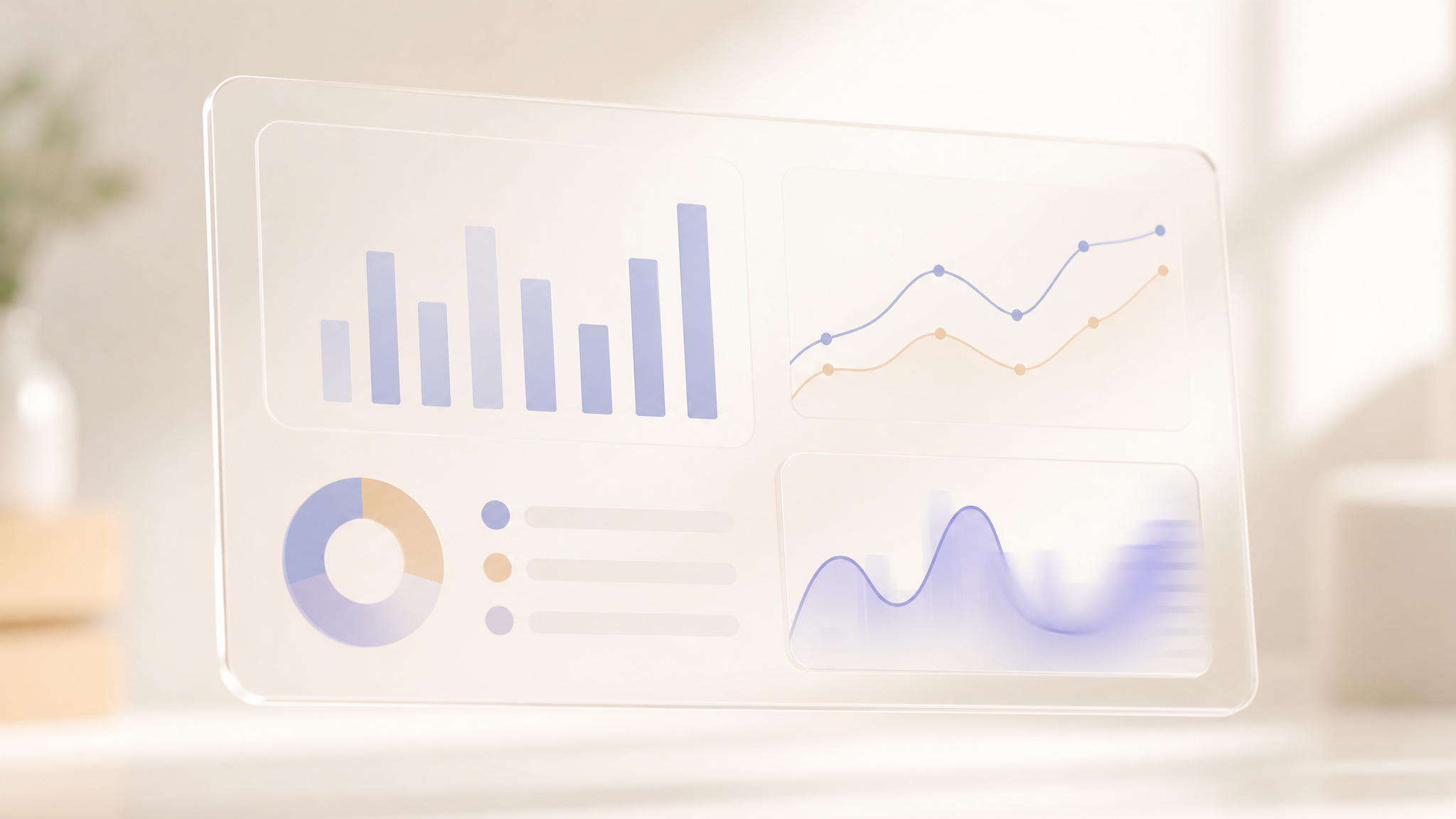
Claude Dashboards connects to a data platform and answers questions in plain language. You can point it at warehouses like BigQuery, Snowflake, Databricks, Amazon Redshift, or ClickHouse, or at a CRM such as Salesforce. Ask how this week's signups compare with last month's, and Claude pulls the data, builds the chart, and keeps it current as the underlying numbers change.
The part that separates it from a one-off answer is what sits behind each number. Click any figure and you see the query that produced it. Each chart shows when its data was last refreshed, so you can tell a stale panel from a live one. That transparency matters. Dashboards that hide their math are hard to trust when the numbers look wrong. Dashboards is in beta on paid plans. It's built to work next to the analytics tools teams already use, rather than replace them. When a question needs deeper digging, you can send the dashboard from Claude to tools like Amplitude, Hex, Mixpanel, Perplexity, or Sigma and keep going there.
Claude Motion Makes Animations Without a Video Model
Claude Motion takes a different route. You ask it to turn a quarterly report into a 30-second explainer, add motion to a chart, or build a product walkthrough. Claude writes code that animates your text, charts, shapes, and images, and the result plays like a short video.
Because it's code under the hood, you can change any word, number, or bit of timing. Edit it yourself in the editor or ask Claude to adjust it. Then download the result as an MP4. Anthropic draws a clear line here: Motion doesn't use a video generation model. There's no generated footage, and no fake people. For teams that can't risk an invented face in a board deck, that distinction is the selling point.
Motion is in beta on Team and Enterprise plans. If you want to take an animation further, you can open it in tools like Adobe, Descript, HeyGen, Luma AI, or Runway, with Canva and Captions coming soon.
Claude Docs, Slides, and Design Leave Beta
The same announcement moved three older features out of beta. Claude Docs, Slides, and Design are now available on every plan, including Free. Anthropic says people have made more than 45 million docs, decks, and designs inside Claude, and that most of what the company shipped since came from user feedback.
Dropping the beta label is a signal about confidence. It also widens the gap between free and paid: the everyday document tools are now open to everyone, while the newer Dashboards and Motion stay on paid tiers. If you use Claude for writing and slides, the update makes those tools more stable and available. If you want the data-heavy features, you'll still need to pay.
What Claude Dashboards and Motion Mean for Teams
The pitch is simple. Data questions usually mean filing a ticket or writing SQL. Ideas that would land better in motion end up as another static slide. Anthropic's bet is that people skip those steps when they're hard. Claude takes the first pass on both.
Both features are in beta, so expect rough edges and shifting limits. The test is whether a dashboard built from a plain-language question holds up when the data gets messy, and whether a Motion clip is good enough to show without a round of fixes. Try Dashboards on a report you already produce. See if the numbers match what your team expects. If they do, the time saved is real. If they don't, you'll want the query view to find out why. Both features are live now for eligible plans, and the docs, slides, and design tools are open to everyone.