
onBeacon
onBeacon · Image
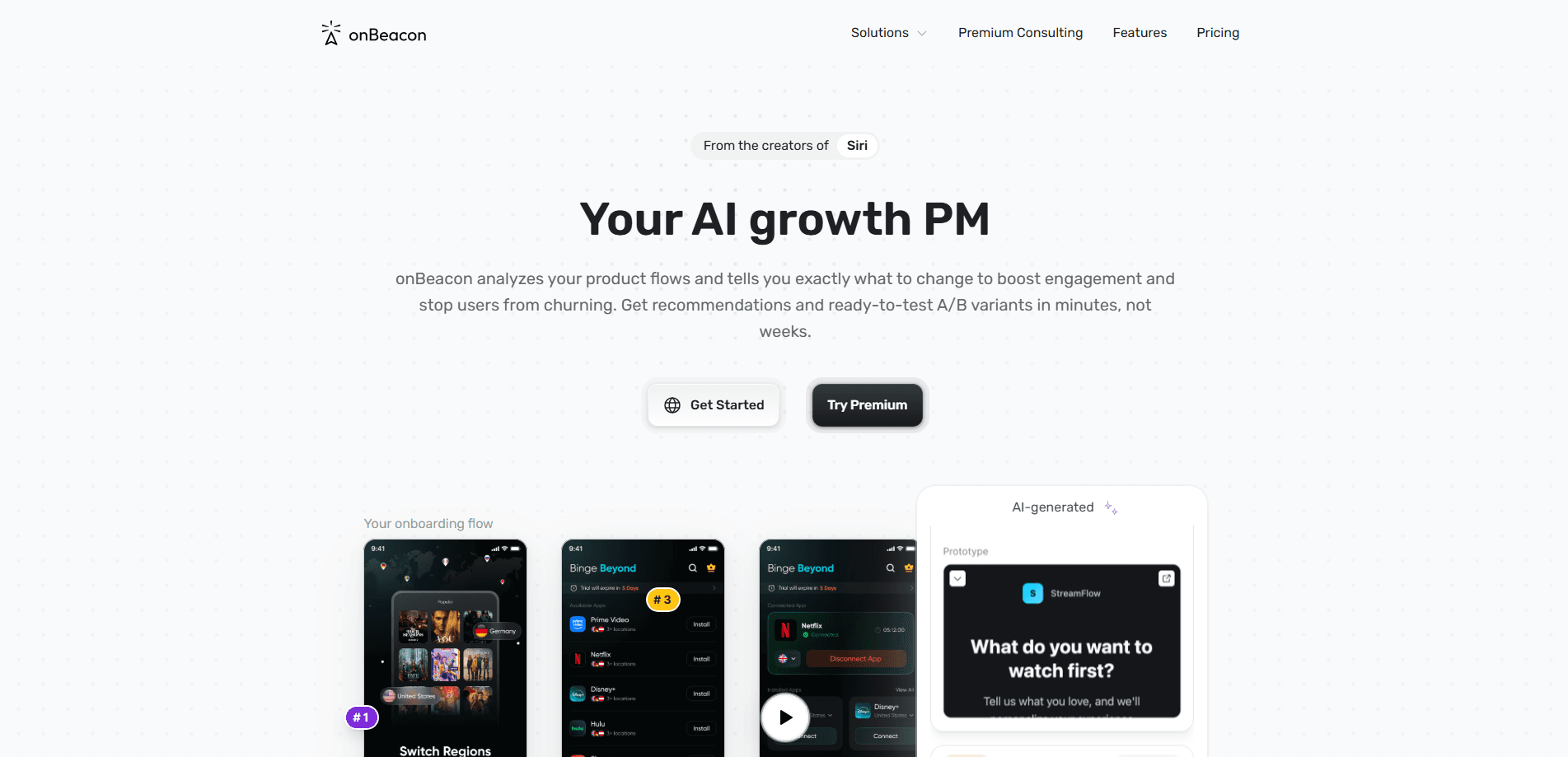
onBeacon is an AI assistant for product and UX teams that turns a screenshot or a live interface into a structured design review in seconds. You hand it a screen or a flow, and it grades layout, color, typography, visual hierarchy, microcopy, and behavioral design principles, then tells you which fixes are most likely to move activation, retention, and conversion. It's built for teams that ship fast and don't always have a senior product designer on call. Fast, specific AI design feedback, without the wait.
About onBeacon
What Is onBeacon
onBeacon is an AI UX audit tool. It watches how a screen is built and how a person would move through it, then writes back a review the way a senior product designer would, except it comes back in seconds instead of days. The pitch is simple: better interfaces, faster decisions, fewer design problems that only surface after launch.
It's aimed at product managers, founders, and designers who need a second opinion before shipping. Most small teams don't have a dedicated UX researcher, and hiring one for every release is unrealistic. onBeacon fills that gap by checking the things that usually get missed under deadline pressure: does the primary action stand out, does the copy explain what to do, does the flow make the next step obvious. The reviews are tied to growth metrics rather than aesthetics, which is the part most design tools skip.
It's a review tool, not a designer. It won't produce finished screens. It can't test with real users, and it works best when you already know what you're trying to achieve. Treat its output as a checklist from a sharp colleague, not a verdict from a research lab.
Getting Started
- Go to onbeacon.ai and sign up with your email or a Google account.
- Upload a screenshot, drop in a link, or share the screen or flow you want reviewed.
- Tell it what the screen is for, so the feedback is framed around the right goal.
- Read the review: it flags issues by category and points to the ones that matter for your metrics.
- Fix the priorities it ranks highest, then run the updated screen through again to check progress.
Product Information
A quick look at onBeacon's pricing, supported platforms, and performance.
Best for
The users, tasks, and scenarios where this tool fits best.
Users
- Product managers who ship interfaces without a designer on staff
- Founders and small teams
- UX and UI designers
Tasks
- Auditing a screen before launch
- Reviewing a signup or onboarding flow
- Checking consistency across a product
- Sanity-checking a redesign
Scenarios
- A release is two days away and nobody has looked at the UI critically. Deadlines push reviews to the bottom of the list.
- You inherited a product and want to know what's broken before you touch anything.
- You're testing a landing page and want a read on whether the primary action is clear.
- You run a small team and need a repeatable design check on every sprint. Same standard, every time.
Key features
Screenshot and link based audits
The core of onBeacon is simple: give it a screen and it gives you a review. You can upload an image, point it at a live URL, or walk it through a flow, and it works through the layout, spacing, and structure the way a designer would look at a mockup. That low setup cost is the point. Nothing to install. Nothing to configure. You can review a competitor's page or your own staging build in the same amount of time.
Feedback tied to growth metrics
Most design tools judge a screen on how it looks. onBeacon judges it on what it's supposed to do. The reviews connect issues to activation, retention, and conversion. So a vague "make this cleaner" becomes something sharper: the primary button competes with three secondary actions, and that's likely to cost you conversions. The whole point is conversion optimization, not decoration. That framing is what separates it from a style checker. It's the reason the output is worth acting on rather than just reading.
Visual hierarchy and layout review
A big share of interface problems come down to what the eye sees first. onBeacon checks whether the most important element on the screen actually reads as the most important element. It flags competing calls to action, weak contrast on key text, crowded sections, and groupings that make the page harder to scan than it needs to be. Your main action should win. For a screen with a single clear goal, that hierarchy check is often the most useful part of the whole audit.
Typography and color checks
Type and color are where small decisions turn into big consistency problems across a product. onBeacon examines type sizes, weight, spacing, and color use, and points out where the choices undercut readability or the intended tone. Fonts matter more than people think. The value isn't in telling you your font is wrong. It's in catching the specific spots where a heading is too quiet, a body size is too small, or a color's contrast is going to be a problem for some users.
Microcopy and behavioral analysis
Copy does more work than most teams give it credit for. onBeacon reads button labels, headings, and form text and judges whether they tell the user what happens next. Does the label say what it does? On top of that, it checks the screen against behavioral design principles, the patterns that shape whether someone follows through or bails. This is the feature that catches "Continue" buttons nobody understands and forms that ask for information before they've earned it.
Review output you can act on
An audit is only useful if someone can act on it. onBeacon organizes feedback by category and flags priorities rather than dumping a wall of notes, so a team can pick up the list and work through it. No wall of text. You get the issue, the reasoning, and a direction for the fix, which is enough for a designer to run with and enough for a non-designer to hand off without a lengthy explanation.
Pros and cons
Pros
- Reviews come back in seconds, which makes it practical to check screens during a sprint rather than after launch.
- Feedback is framed around activation, retention, and conversion, so priorities map to business outcomes instead of taste.
- No design file or plugin needed: screenshots and links are enough to start.
- Useful for teams without a dedicated designer, and a fast first pass for teams that have one.
- Covers the categories that usually slip through, including microcopy and behavioral patterns.
Cons
- It reviews screens; it doesn't design them, so you still need someone to decide and implement the fixes.
- Recommendations are AI-generated, so a human should sanity-check them against your product context before acting.
- Pricing and API details aren't clearly published, which makes it hard to plan a larger rollout up front.
- It can't replace real user testing, so high-stakes screen changes still need actual users.
Frequently asked questions
onBeacon reviews a UI screen or flow and returns an AI-generated UX audit. It looks at layout, color, typography, hierarchy, microcopy, and behavioral principles, then points out the changes most likely to help activation, retention, and conversion. Think of it as a fast design review from a tool that never gets tired.
Related content
Explore related tools, skills, and articles for onBeacon.
onBeacon Alternatives

Google EmbeddingGemma 2
Google DeepMind · Writing · Image · CodingGoogle EmbeddingGemma 2 is a 740M-parameter open model that turns text, code, images, audio, and video frames into vectors in one 768-dimension space, running on phones and laptops.

Tractionwave
TractionWave · Image · MarketingTractionWave is an AI attention heatmap tool for static ads. Upload a PNG or JPG and it returns predicted attention, ranked hotspots, and fixes before you spend budget.

Imejis.io
Imejis.io · Image · MarketingImejis.io is an AI design studio for agents and marketing teams. Describe an image in plain words, and it writes the copy, builds the layout, reflows it to every size, then exports a finished file.