
Claude Dashboards & Motion
Anthropic · Video · Productivity · Business
Claude Dashboards & Motion are two Claude features from Anthropic: one turns company data into a live dashboard, the other builds an editable animated explainer as an MP4 file.
About Claude Dashboards & Motion
What Is Claude Dashboards & Motion
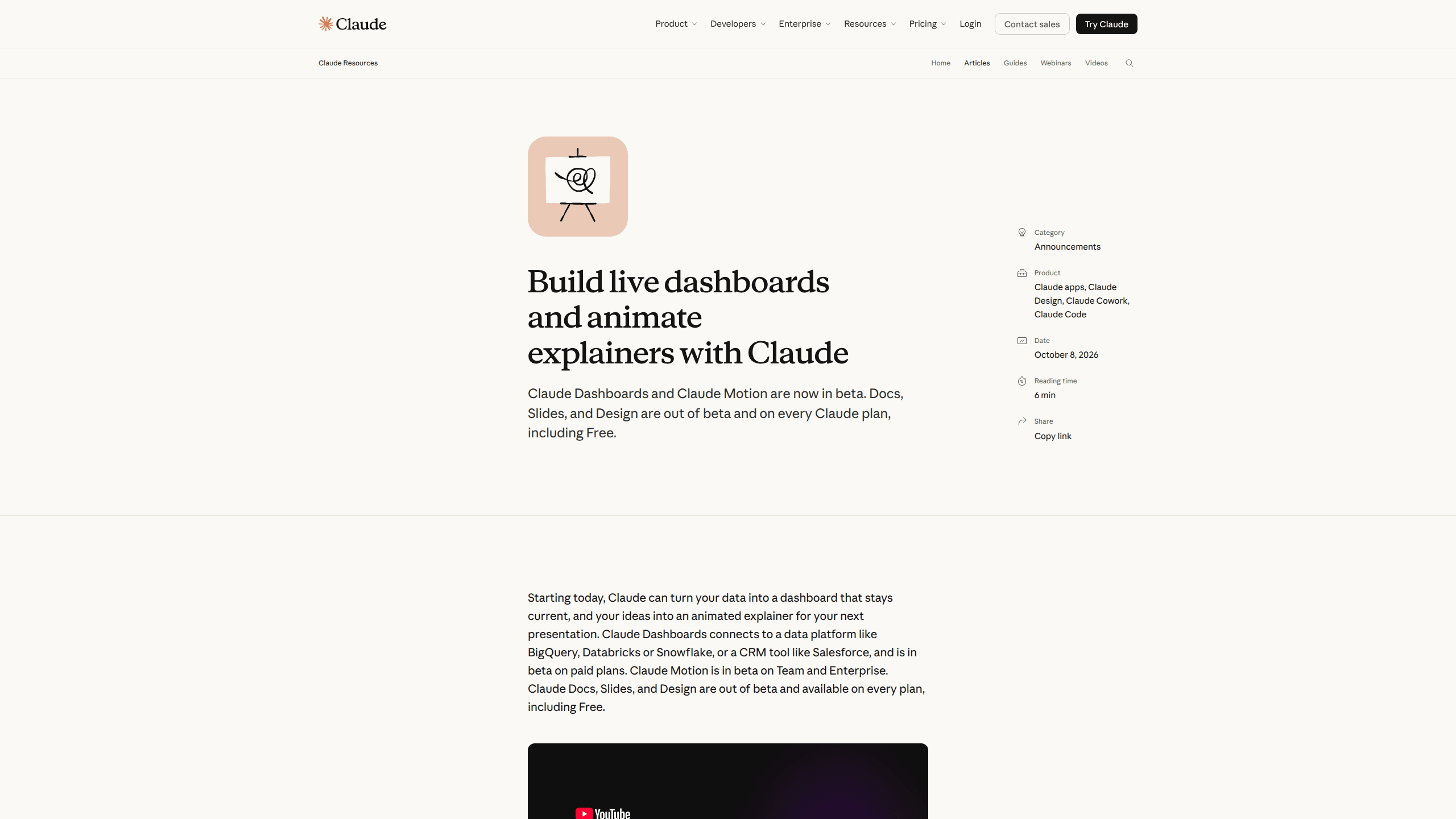
Anthropic added both tools to Claude on October 8, 2026. Claude Dashboards answers questions about your own business data and draws the chart for you. Claude Motion takes a written idea and builds a short animation that plays like a video.
Both sit inside the Claude app, next to the chat box. What comes back is the difference: a file you can keep, open, and share, instead of a paragraph you'd have to rebuild in another program.
Each tool also shows its work. Click a number on a dashboard and the query behind it appears. Open an animation and you find code, with your words, numbers, and timing written out line by line. That matters when the output goes in front of a finance lead or a customer.
The limits are worth knowing before you start. Dashboards is in beta on paid plans and needs a connected data source. Motion is in beta on Team and Enterprise. On Enterprise, admins have to switch both on in Organization settings > Artifacts, because Anthropic ships them off by default.
Getting Started
- Open Claude and connect a data platform such as BigQuery, Databricks, Snowflake, Amazon Redshift, or ClickHouse. Salesforce works through the existing connector.
- Ask for the output in plain language, for example "Build a dashboard of this quarter's revenue by region" or "Animate how our pricing plans compare for the sales kickoff."
- Check the result. On a dashboard, click any figure to read the query and confirm the data refresh time. On an animation, play it through once before you change anything.
- Edit in place or tell Claude what to adjust, then share it with your team or download the animation as an MP4 file.
Product Information
A quick look at Claude Dashboards & Motion's pricing, supported platforms, and performance.
Best for
The users, tasks, and scenarios where this tool fits best.
Users
- Operations and finance analysts who answer the same metric questions every week and want the chart built once, then kept current.
- Team leads and founders who need a board or all-hands visual without waiting on a design queue.
- Sales and customer success managers who already keep pipeline data in Salesforce and want a dashboard without writing SQL.
Tasks
- Weekly metric checks, such as comparing this week's signups with last month's, where the answer needs a chart rather than a paragraph.
- Turning a quarterly report into a 30-second animated explainer for an all-hands meeting.
- Product walkthroughs for customer onboarding, where motion shows a flow faster than screenshots do.
- Exploratory questions about company data that would otherwise turn into a ticket for the analytics team.
Scenarios
- A leadership meeting where someone asks for a number you don't have and the dashboard can be pulled up on the spot.
- A sales kickoff that needs a pricing comparison in motion, not another static slide.
- A recurring report that has to stay accurate as new rows land in the warehouse.
Key features
Plain-language questions on company data
You type a question the way you'd ask a colleague, and Claude writes the query, runs it, and draws the result. No SQL editor, no waiting for the analytics team to pick up a ticket. The tradeoff is scope: Dashboards is built for quick, exploratory questions rather than long modeling work.
Charts that stay current
A live dashboard refreshes as the underlying data changes, so the number in the meeting is the number in the warehouse. Each chart shows when its data was last refreshed, which settles most arguments about whether a figure is stale. You can share a dashboard with teammates or with people outside your organization, if your admin allows external links.
Query transparency on every number
Click any figure and the query behind it opens. You can also ask Claude to explain the result in words. This is the feature that makes an AI data dashboard usable in a review: a reviewer can trace a number back to its source instead of trusting the chart.
Animation built from code, not generated footage
Claude Motion writes code that animates your text, charts, shapes, and images. Every word, number, and timing cue can be changed. Anthropic is explicit that Motion doesn't use a video generation model, so there's no stock footage and no synthetic presenter. For internal explainers, that removes a whole category of approval problems.
Editing and MP4 export
Animations play inside Claude like a short video. You can adjust them in the editor or ask Claude for a change in plain language, then download the finished clip as an MP4. The MP4 export is what makes the output usable in a deck, a Slack post, or a training video.
Handoff to your existing tools
Dashboards sends a question to Amplitude, Grafana, Hex, Mixpanel, Omni, Perplexity, PostHog, or Sigma when the analysis needs more depth than a chart. Databricks Genie, Looker, monday.com, and Tableau are listed as coming. Motion opens in Adobe, Descript, HeyGen, Higgsfield, invideo, Luma AI, or Runway, with Canva and Captions coming. Claude Artifacts hold the output in both cases, so the handoff starts from something real rather than a blank project.
Pros and cons
Pros
- The output arrives as an editable file. You can change a label or a number without asking Claude to start over.
- Query visibility gives reviewers a way to check a figure, which is the usual blocker for AI-generated reporting.
- Dashboards reads from the warehouses most teams already run, including BigQuery, Snowflake, Databricks, Redshift, and ClickHouse.
- Motion produces clean motion graphics for explainers without the uncanny look of AI video.
Cons
- Both tools are still beta, and Motion is limited to Team and Enterprise, so individual Pro users can't try the animation side yet.
- Enterprise admins must enable each tool manually, and an organization that misses the setting will see nothing in the interface.
- Dashboards handles quick questions well but won't replace a full BI model, so deeper analysis still moves to another tool.
- Motion is not a footage generator. If you need filmed scenes or a presenter, it's the wrong tool.
Frequently asked questions
Dashboards works with data: it connects to a warehouse or CRM, answers a question, and builds a chart that updates itself. Motion works with ideas: it turns a prompt into a short animation you can edit and export. One is for numbers, the other for explanation.
Related content
Explore related tools, skills, and articles for Claude Dashboards & Motion.
Claude Dashboards & Motion Alternatives

ngram 2.0
ngram · Video · Marketingngram 2.0 is an AI video generator for teams. It turns a prompt, a screen recording, or a product URL into a narrated explainer, product demo, or AI avatar video, and every scene stays editable.

OpenScreen 2
OpenScreen (open-source project) · Video · ProductivityOpenScreen 2 is a free, open-source screen recorder and demo video editor for Windows, macOS, and Linux, with automatic zooms, styled frames, local captions, and agent edits.

Skreno
Skreno · Video · ProductivitySkreno is a browser screen recorder that captures a tab, a window or your whole display, then attaches AI transcripts, summaries and console logs to one share link.