
NextUI
HeroUI (formerly NextUI) · Image · Coding
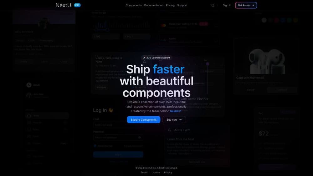
NextUI Pro, now sold as HeroUI Pro, is a premium React and React Native component library with ready-made templates, themes, and AI tooling that builds on the free HeroUI kit.
About NextUI
What Is NextUI Pro
NextUI Pro is the paid tier of NextUI, the popular React UI library that rebranded to HeroUI. The free library still ships as HeroUI OSS, and Pro is what you buy when the open components are not enough. You get application-grade pieces like a full data grid, a command palette, kanban boards, file trees, and KPI cards, each documented and ready to drop into a project.
The product moves fast. The team ships new components, themes, and fixes as regular package updates, and Pro is currently in its 1.0 beta line for React. If you already build on HeroUI OSS, Pro follows the same patterns, so the learning curve is short. Teams reach for it when they want a polished dashboard or chat interface without styling every control by hand.
Two limits matter. Pro is licensed software for React and React Native projects, not a drag-and-drop builder, so you still need to write code. And it is a paid product with no free tier of its own, since the free path is the separate open-source HeroUI library.
Getting Started
- Buy a Web, Mobile, or Super license on the official site, which unlocks the packages for your account.
- Connect your GitHub account, since package keys are provisioned per platform.
- Run the heroui-pro CLI to log in and install the components and their peer dependencies.
- Add the Pro styles to your main CSS file, keeping the import order the docs specify.
- Import a Pro component and start building, or pull a template for a head start.
Product Information
A quick look at NextUI's pricing, supported platforms, and performance.
Best for
The users, tasks, and scenarios where this tool fits best.
Users
- Front-end developers on React
- Teams shipping internal tools fast
- React Native developers wanting matching UI
Tasks
- Building admin dashboards
- Crafting AI chat interfaces
- Assembling marketing pages and forms
- Theming a product to a brand
Scenarios
- A startup pushing an MVP to market
- An agency running several client projects
- A team already deep in the HeroUI library
Key features
Application Components Beyond the Basics
Pro adds the screens a real app needs, not just buttons and inputs. You get a full-featured data grid with sorting, pinned columns, and row reordering, plus a command palette, kanban board, agenda, and file tree. These are the pieces that usually eat a sprint, and here they arrive documented and integrated.
A Complete AI Chat Toolkit
The library ships chat primitives for conversations, messages, prompt inputs, attachments, sources, tool calls, and reasoning traces. Marks and code blocks render streamed answers cleanly. For anyone building an assistant, this covers the interface work that sits between your model and your users.
React and Native Under One Roof
The same UI design system spans web and mobile. As a React Native UI kit, the mobile set follows a similar API to the web components, and the Super license bundles both, so a team can ship to iOS, Android, and the browser without juggling separate kits.
Design Systems You Can Export
You build a custom theme on screen, watch it update live in the docs, then export the CSS. A theme sync plugin keeps Figma files aligned with your tokens. It turns theming from a stylesheet hunt into a visual task a designer can drive.
AI Tooling for Your Editor
An MCP server feeds Pro and OSS docs straight into editors like Cursor, Claude Code, and VS Code. Agent skills teach an assistant how to build with the library. It is a small addition that saves a lot of doc-tab switching.
Built on Tailwind CSS and React Aria
Components run on React 19, Tailwind CSS v4, and React Aria, so accessibility and styling come from established foundations. Fully typed APIs and predictable patterns mean autocompletion stays helpful as projects grow.
Pros and cons
Pros
- Ships the heavy components, like a data grid and command palette, that take the longest to build by hand.
- Keeps one API across web and mobile, which lowers the cost of supporting both.
- Backed by a fast release cadence, with new components and themes arriving as routine updates.
- Perpetual license means you keep the version you paid for even if you skip renewal.
- Design Systems and the Figma plugin connect design and code instead of leaving them apart.
Cons
- No free tier, so you cannot trial the components in a real project without buying a license.
- It is a code library for React and React Native, which rules out teams on Vue, Angular, or no-code platforms.
- Downloads carry a daily cap on individual plans, so heavy CI without caching can hit the limit.
- Docs and themes are still in a 1.0 beta line, so the surface can shift between releases.
Frequently asked questions
NextUI Pro is the paid component library from the team behind NextUI, now branded HeroUI Pro. It extends the free HeroUI OSS library with premium React and React Native components, templates, themes, and AI tooling.
Related content
Explore related tools, skills, and articles for NextUI.
NextUI Alternatives

Tractionwave
TractionWave · Image · MarketingTractionWave is an AI attention heatmap tool for static ads. Upload a PNG or JPG and it returns predicted attention, ranked hotspots, and fixes before you spend budget.

Imejis.io
Imejis.io · Image · MarketingImejis.io is an AI design studio for agents and marketing teams. Describe an image in plain words, and it writes the copy, builds the layout, reflows it to every size, then exports a finished file.

Layoutr
Van Dijk Ontwikkeling · Image · China AILayoutr is a browser floor plan tool that scales your own plan, places furniture at true size, shows the room in 3D and renders it with AI.